
Theme
Design reference
Provenance
- Source: Figma Make file Wireframe Components Design.
- File key:
jWi0xhPKpEgJEpjZlpC4z1. - Captured version: Version 5.
- Owner shown in Figma: Delycia.
- Access during capture: view-only.
- Captured: 16 July 2026, Africa/Johannesburg.
The screenshots below are curated evidence from the approved internal source bundle. The raw ZIP, proprietary .make archive, generated preview JavaScript, and generated stylesheet are deliberately not served.
Component set
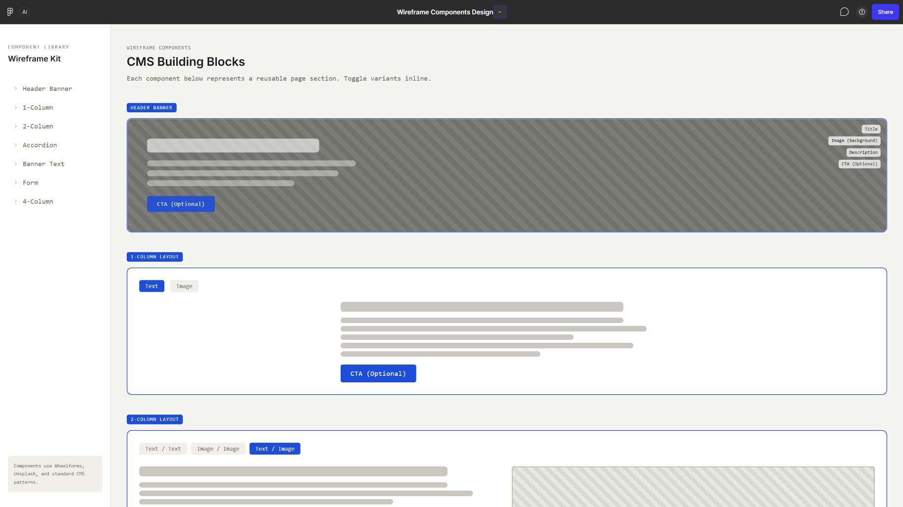
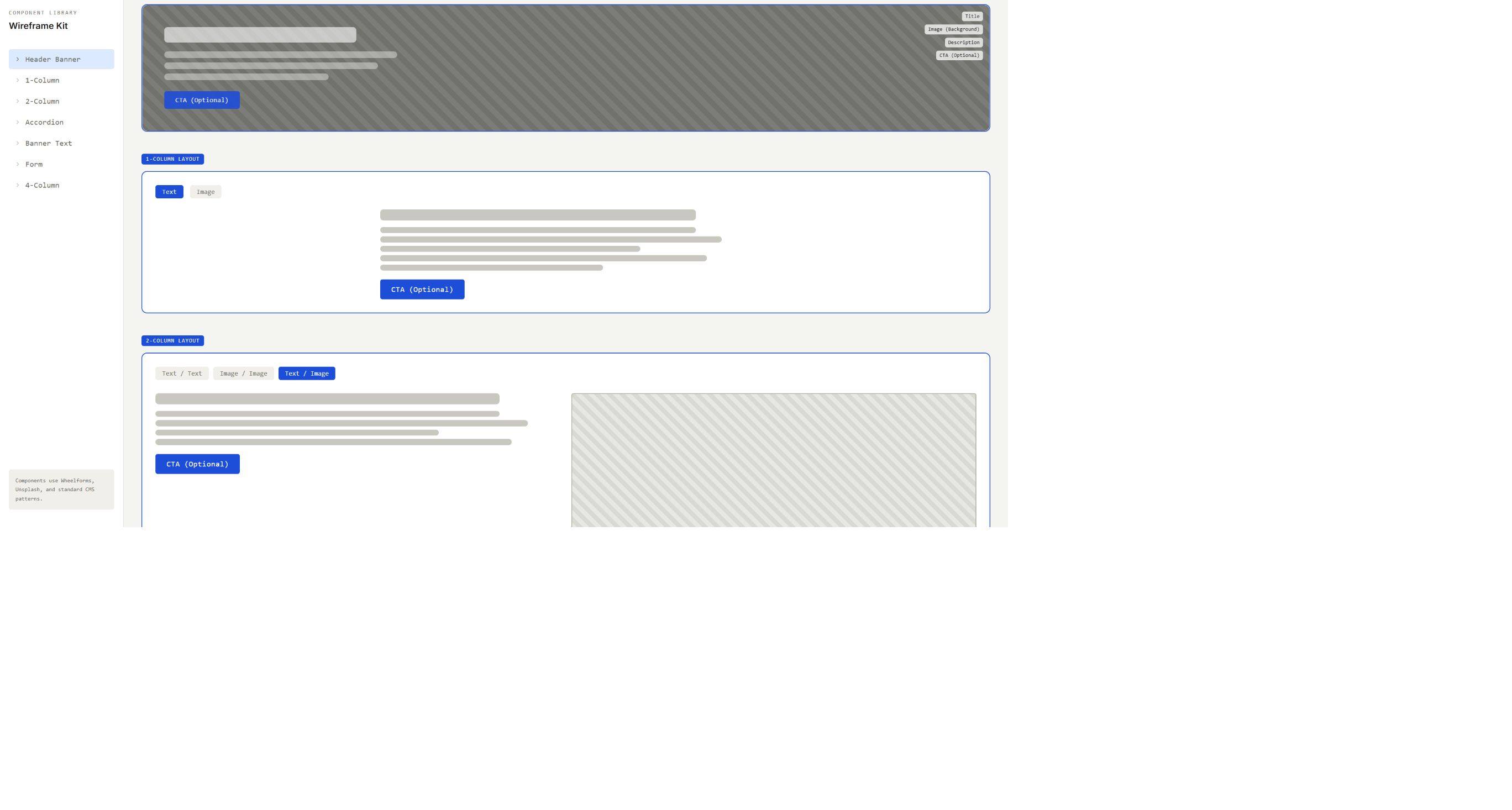
- Header Banner with title, background image, optional description, and optional CTA.
- One-Column Layout with Text or Image variants and an optional CTA.
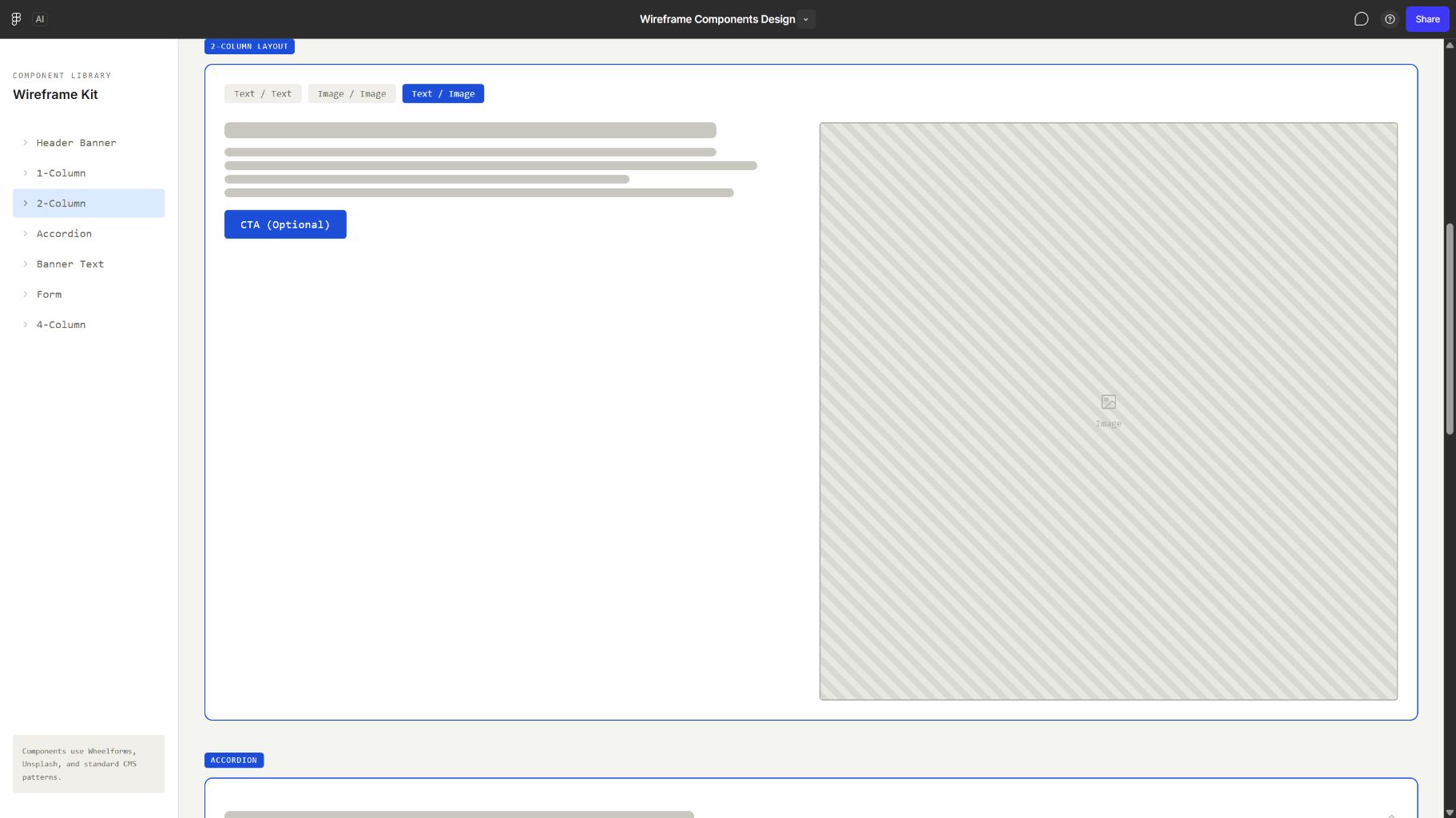
- Two-Column Layout with Text/Text, Image/Image, and Text/Image variants.
- Accordion with expandable rows.
- Full-width Banner Text with optional CTA.
- Contact-form reference.
- Four-Column image-card layout with optional text.
Curated captures
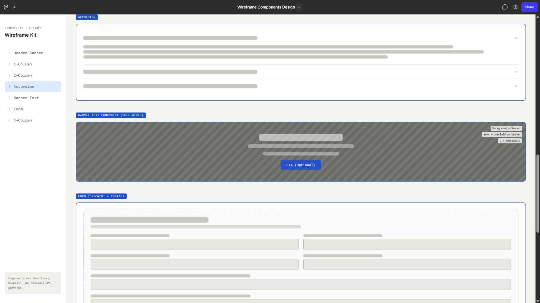
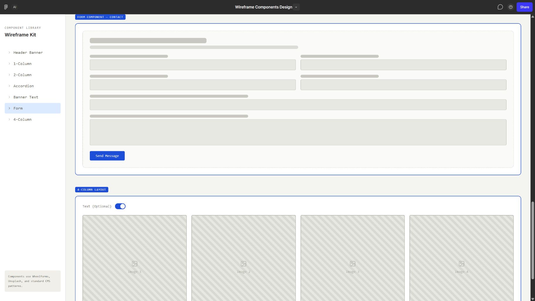
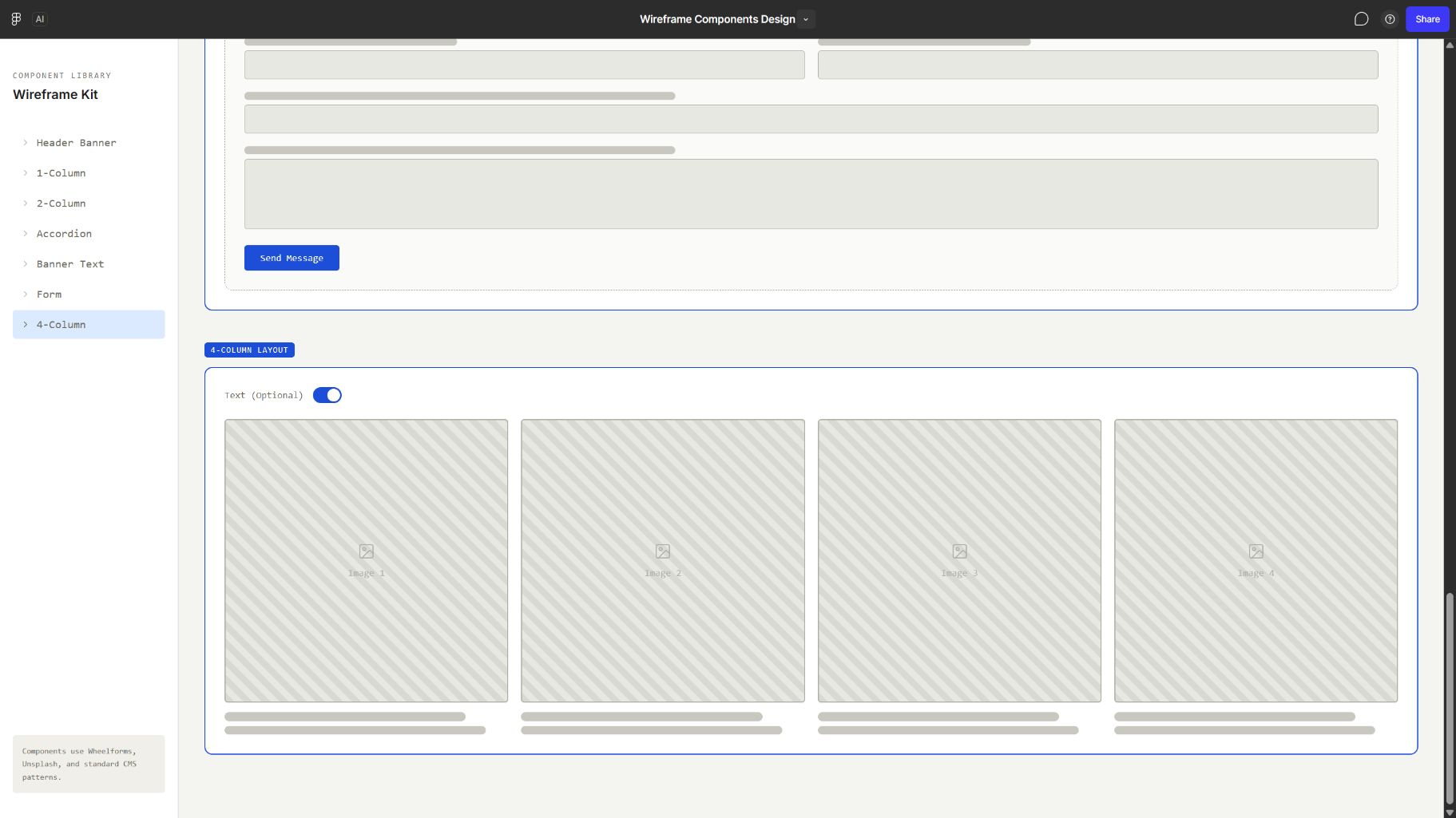
Recorded responsive behaviour
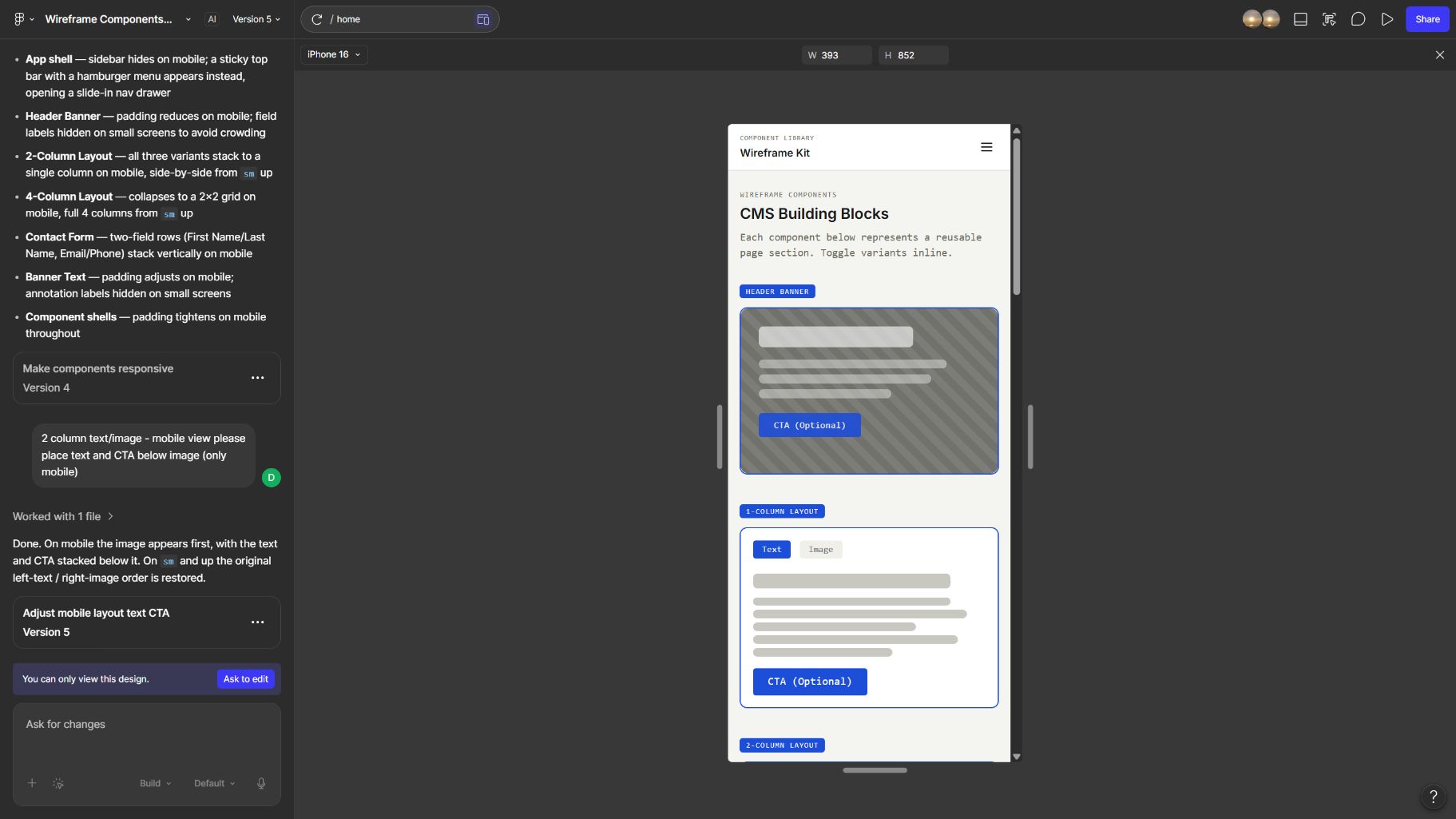
- The sidebar becomes a mobile top bar and navigation drawer.
- Component padding tightens and annotation labels disappear on small screens.
- Two-column variants stack from one column to two at the reference
smbreakpoint. - Text/Image places the image before the text and CTA on mobile.
- Form field pairs stack vertically on mobile.
- The captured Four-Column layout uses a 2×2 mobile grid, which conflicts with the PDF's single-column requirement.
Limitations
The reference demonstrates layout intent, not production code. It does not settle semantic HTML, Craft field configuration, brand tokens, final breakpoints, content constraints, or accessibility acceptance.